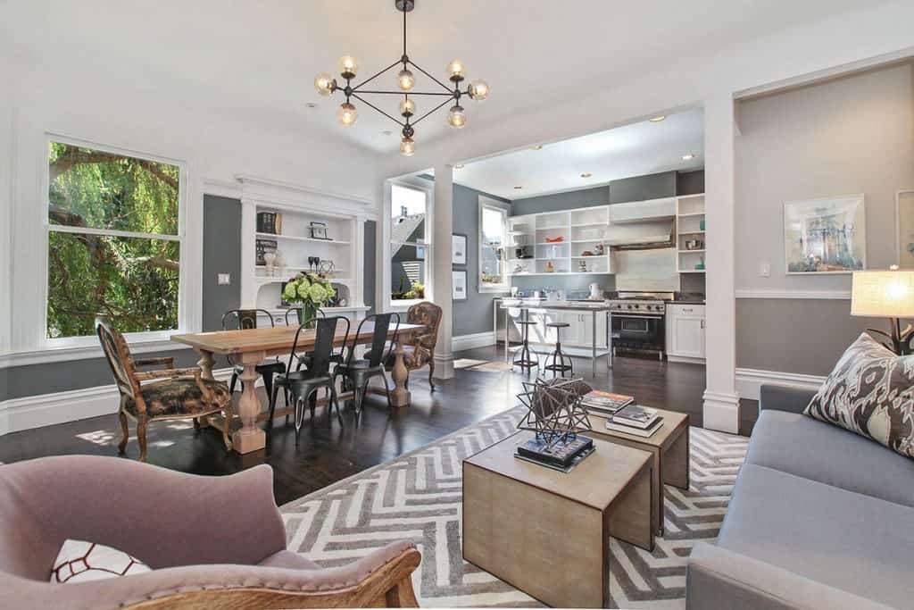
Within the world of home decor, the color white (or possibly is it non-color?) has reigned supreme for quite a while. However the everything-white fad is apparently fading. Want proof? Paint companies Sherwin-Williams and Benjamin Moore have both recently announced their 2017 Color of the Year, and they’ve taken a decidedly darker turn.

Tired of White? 2017’s Color of the Year Go to a Dark Place
Sherwin-Williams-which heralded Alabaster as being the “it” color for 2016-has picked Poised Taupe for 2017. Sue Wadden, director of color marketing for the company, described it in this way on the Today Show: “It’s like gray and brown had a baby.” Go for it, homeowners!
Meanwhile, Benjamin Moore-whose top color a year ago was Simply White OC-117-is venturing into even more daring territory: Shadow, a purplish hue that “calls to mind a ‘past’… sophisticated, provocative and poetic, it can bring energy to a space or harmony and a moment of respite” in the strenuously poetic words of the company’s creative director, Ellen O’Neill.
Will Shadow and Poised Taupe work their way into the hearts, wallets, and living rooms of homeowners everywhere? Tough to say. But certainly real estate professionals and interior designers are welcoming the movement faraway from white.
“I have noticed more and more homeowners experimenting with colors other than the typical shades of white,” says designer Denise Foley. “Darker shades can add depth to a room, while still acting as a neutral, and really help ground the space.”
Another perk? “Using darker colors can definitely highlight architectural details by providing a stark contrast with trims and moldings,” says San Francisco Realtor Shane Ray, who recently staged a property where the walls were painted in a shade called “Jailhouse Rock” from C2 Paints. “In the past, we would let the furniture provide the personality, but now, a really bold paint color can provide impact as soon as you enter a room.”
Still, will homeowners pivot after hearing again and again (and over again) that white is ultimate way to lighten and brighten your home?
The key is using darker hues selectively. “One safe place where I like to use them is bathrooms,” says interior designer Sam Jernigan at Renaissance Design Consultation. One client recently took her suggestion and painted her bathroom black, which worked by “retaining the crisp white ceiling trim, plus use of a mirror and a dramatic light fixture.”
But open your mind! Dark colors don’t need to be confined to small rooms.
“Other uses for rich, dark colors are on a soaring ceiling, especially a cathedral or over 10 feet high,” says Jernigan.
“Dark colors visually advance a space and sometimes, can make it feel cozier,” says Jerrigan. “It’s sort of like a snuggling-up-with-an-afghan-on-a-sofa feeling.”